
CSS Grid in 2026: Subgrid Is Everywhere — Here's How to Actually Use It
CSS Subgrid reached full cross-browser support in 2023 and is changing how developers build complex layouts. This guide covers the Grid fundamentals you need, how Subgrid solves the alignment problem, and when Grid beats Flexbox.

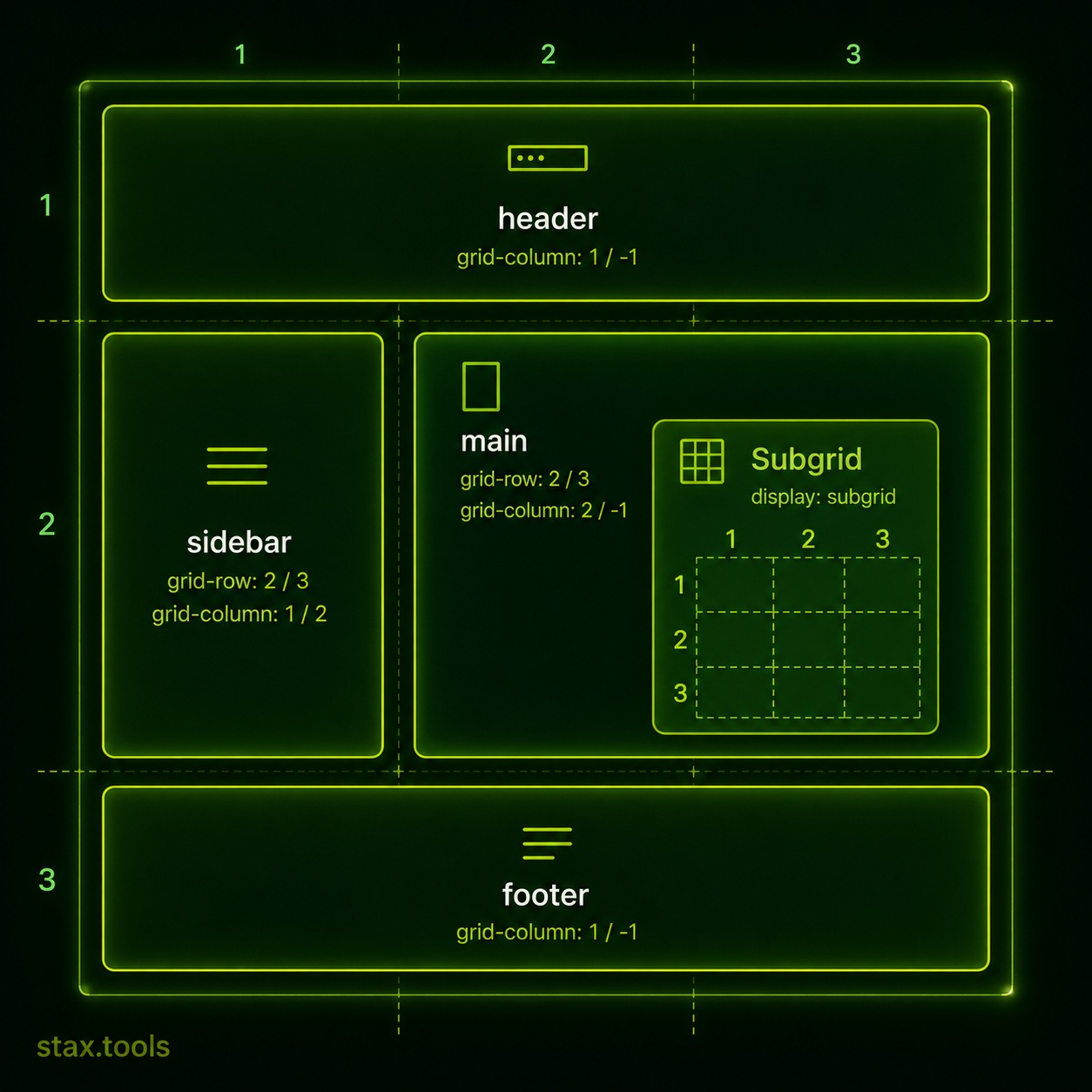
CSS Grid received its most significant upgrade since launch when Subgrid shipped in all major browsers — Chrome 117 (August 2023) was the last holdout after Firefox (2019) and Safari (2022). As of 2026, Subgrid is supported by over 94% of global browser traffic according to Can I Use. If you learned Grid before 2023, there is a meaningful addition to revisit.
This guide covers the Grid fundamentals that most tutorials skip, the Subgrid pattern that solves the most common layout problem, and a clear answer to "Grid vs Flexbox."
The fundamental mental model: rows AND columns simultaneously
Flexbox is one-dimensional — it arranges items along a single axis (row or column). Grid is two-dimensional — it creates rows and columns simultaneously and lets you place items anywhere in the resulting matrix.
.container {
  display: grid;
  grid-template-columns: 1fr 2fr 1fr;  /* 3 columns, middle is twice as wide */
  grid-template-rows: auto 400px auto;  /* 3 rows, middle is fixed height */
  gap: 24px;
}
1fr is a fraction unit — it takes "1 share of the available space." Three columns of 1fr 2fr 1fr distribute space in a 1:2:1 ratio. This is different from percentage widths because fr accounts for gaps automatically.
Build and preview grid layouts in real time at the Stax CSS Grid Generator.
Placing items on the grid
By default, grid items flow automatically into the next available cell. You can override this with explicit placement:
.hero {
  grid-column: 1 / -1;   /* Span from first column line to last */
  grid-row: 1 / 2;
}

.sidebar {
  grid-column: 3 / 4;
  grid-row: 2 / 4;        /* Span two rows */
}
Line numbers start at 1 for the left/top edge and -1 for the right/bottom edge. grid-column: 1 / -1 spans the full width regardless of how many columns exist — useful for responsive layouts where the column count changes.
Named areas make placement self-documenting:
.container {
  grid-template-areas:
    "header header header"
    "sidebar main main"
    "footer footer footer";
}

header  { grid-area: header; }
.sidebar { grid-area: sidebar; }
main    { grid-area: main; }
footer  { grid-area: footer; }
The repeat() and minmax() functions
These two functions handle responsive column definitions without media queries:
/* Auto-fill as many columns as fit, minimum 200px each */
grid-template-columns: repeat(auto-fill, minmax(200px, 1fr));
auto-fill creates as many columns as will fit. minmax(200px, 1fr) means each column is at least 200px but grows to fill available space. On a 900px container with 24px gaps: 4 columns of ~204px each. Resize to 600px: 3 columns. Resize to 250px: 1 column. Zero media queries — though if you still need a breakpoint for a layout that repeat()/minmax() alone can't express, our mobile screen sizes guide has the real device widths worth designing around.
auto-fit (vs auto-fill) collapses empty tracks — useful when you have fewer items than columns would allow and want them to expand rather than leave empty columns.
The problem Subgrid solves
Before Subgrid, every grid item was its own independent grid. If you had a card grid and wanted the card titles and buttons to align across cards of different content lengths — the classic "align baselines across independent items" problem — you had JavaScript workarounds or fixed heights.
The problem:
<div class="card-grid">
  <article class="card">
    <h2>Short title</h2>
    <p>One line of text.</p>
    <button>Read more</button>
  </article>
  <article class="card">
    <h2>A much longer title that wraps to two lines</h2>
    <p>Three lines of content that push the button down further than the neighbouring card.</p>
    <button>Read more</button>
  </article>
</div>
Without Subgrid, the two buttons sit at different heights. With Subgrid:
.card-grid {
  display: grid;
  grid-template-rows: auto auto auto; /* title, content, button rows */
  gap: 16px;
}

.card {
  display: grid;
  grid-row: span 3;          /* Each card spans 3 parent rows */
  grid-template-rows: subgrid; /* Inherit the parent's row tracks */
}
Now all cards share the same row tracks. The tallest title defines the title row height for every card. The tallest content block defines the content row. Every "Read more" button aligns perfectly — no JavaScript, no fixed heights, no hacks.
This is the pattern Subgrid was designed for and it is now production-ready across all major browsers.
Grid vs Flexbox: the actual decision
The "Grid vs Flexbox" framing is largely a false choice — they solve different problems and work well together. But there are genuine preference cases:
| Use case | Better choice | Why |
|---|---|---|
| Page-level layout (header, sidebar, main, footer) | Grid | 2D placement |
| Card grid with alignment across cards | Grid + Subgrid | Row/column alignment |
| Navigation bar (items in a row) | Flexbox | 1D, spacing between items |
| Form fields (label + input pairs) | Grid | Column alignment |
| Button group | Flexbox | 1D wrapping |
| Masonry/Pinterest layout | Grid (grid-template-rows: masonry) |
CSS masonry (Firefox + Chrome flag in 2026) |
| Centering a single element | Either | display: grid; place-items: center or Flexbox |
| Component internals (icon + text) | Flexbox | Simple 1D alignment |
| Holy Grail layout | Grid | Simpler than Flexbox equivalent |
The practical rule: use Grid when you're thinking about rows and columns simultaneously. Use Flexbox when you're thinking about a single axis with wrapping.
See Flexbox patterns at the Stax CSS Flexbox Playground. Bookmark our CSS Grid cheat sheet and Flexbox cheat sheet for quick syntax lookups the next time you're deciding between the two.
The gap property: consistent spacing without margin hacks
Before Grid and Flexbox, consistent spacing required margin tricks — margin-right on all items except the last (:last-child { margin-right: 0 }), or negative-margin wrappers. Both are fragile.
gap (formerly grid-gap) adds space between grid cells or flex items without outer margin:
.container {
  gap: 24px;           /* Same gap in all directions */
  gap: 16px 24px;      /* row-gap column-gap */
}
gap is now supported in both Grid and Flexbox, and in multi-column layout. It is the correct way to add consistent spacing in modern CSS.
Practical patterns to copy
Full-bleed layout with content column:
.page {
  display: grid;
  grid-template-columns:
    minmax(16px, 1fr) minmax(auto, 720px) minmax(16px, 1fr);
}
.full-bleed { grid-column: 1 / -1; }
.content    { grid-column: 2; }
12-column responsive grid:
.grid {
  display: grid;
  grid-template-columns: repeat(12, 1fr);
  gap: 24px;
}
.col-4 { grid-column: span 4; }
.col-8 { grid-column: span 8; }
Auto-responsive card grid:
.cards {
  display: grid;
  grid-template-columns: repeat(auto-fill, minmax(280px, 1fr));
  gap: 20px;
}
Once your layout CSS is finalized, running it through a minifier trims the extra whitespace before shipping — see our guide on minifying CSS and JavaScript without build tools.
By Harshil Shah, developer and founder at Stax Tools. Browser support figures sourced from Can I Use (caniuse.com) as of May 2026.
Sources & methodology
Harshil
Developer & Founder, stax.tools
Harshil is the developer behind stax.tools, building privacy-first tools that run entirely in your browser.
More by Harshil →Tools mentioned in this article
- CSS Grid Generator
Build CSS Grid layouts visually with live preview. Set columns, rows, gap, and alignment. Copy the generated grid CSS instantly.
- CSS Flexbox Playground
Experiment with Flexbox properties visually — flex-direction, justify-content, align-items, flex-wrap, align-content, and gap. Copy the generated CSS.
Related reading
 URL Encoding Explained: Why Your Links Break and How Percent-Encoding Fixes ThemWhat percent-encoding actually is, which characters must be encoded in a URL and why, the difference between encodeURI and encodeURIComponent in JavaScript, and common bugs it causes in production.5 min read
 CORS Errors Explained: Why Your Browser Blocks the Request (and the Exact Headers That Fix It)A scenario-first walkthrough of how CORS works — why the Same-Origin Policy exists, what each CORS error message means, preflight requests explained, and exactly which server headers fix the problem.6 min read
 How to minify CSS and JavaScript without a build toolYou don't need Webpack, Vite, or a Node.js pipeline to minify CSS and JavaScript. Here's how to shrink your assets in the browser, on the command line, or inside your editor.7 min read
 Mobile Screen Sizes in Pixels: What Designers and Developers Actually Need to KnowStandard phone dimensions, iPhone and Android widths, device pixel ratio, and the CSS breakpoints that matter in 2026 — answered question by question.6 min read
Found this useful?
Browse 235+ free privacy-first tools — no login, no uploads, instant results.